The Orange Market
The Orange Market started in the Bay Area as a website and delivery app for healthy meal options. The app was designed to accommodate both healthy dietary needs and affordable pricing. I was the solo UX content strategist on the team and developed onboarding, checkout, layouts, incorporated UX Research about competitors, etc. (another writer worked out the details of menu options).
Orange Market logo/illustration
OVERVIEW:
I worked on this food delivery application as a solo UX Writer and Content Strategist. It is currently released by location in phases, starting in the Bay Area. I created the writing and initial style guides that will connect food vendors with the company and bring respect and value to the work and meals they are creating. Aware of the cracks in our country’s food system after years of experience in the domain, the founders hope to provide healthy, wholesome meals while considering individual food diets/restrictions. The mission is to make it easier for all communities to access. It was a great opportunity to work on this project and we are all eager to see how this can continue to expand and grow to be a healthy food resource.
CHALLENGE
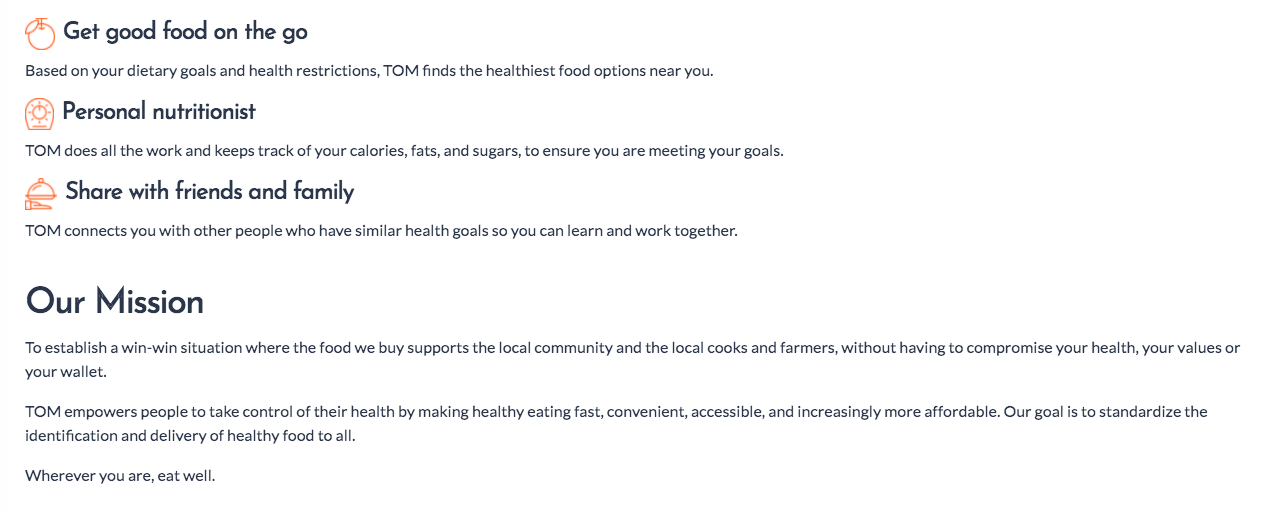
Get customers to create ‘Palates’ and understand how TOM can help them with healthy eating choices. Give a full variety of options without adding complications to the order process.
Create an end-to-end checkout and payment system linking orders to delivery service and food vendors.
SOLUTION
Describe to users in simple, clear language that enables trust and engagement.
Get users to let TOM help them find and eat healthy food. The Orange Market aims to make meal options affordable and prioritizes nutritional value. Customers can rely on TOM for consistent, healthy eating while supporting great food vendors in the Bay Area.
MY ROLE
Collaborated with the founder and the product designer to articulate goals and align with key messages
Wrote content for the title categories below (and more)
Edited any existing copy for clarity and tone of voice
Developed new copy and collaborated in the user research testing process
Created payment UX flows
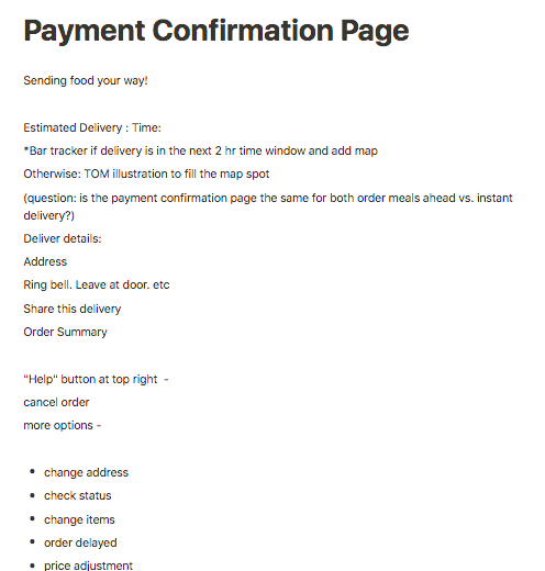
PAYMENT CONFIRMATION
The writing needed to be concise. When I conducted user research with the check-out flow of other competitors, I noticed many required payment details before adding anything to a cart or they presented surprise fees at the end. We chose to be intentional and upfront with the user about the price ranges and consistent throughout the ordering process. If customers experienced frustration with ordering they would be unlikely to return. With research and testing, I confirmed that all potential problem areas had been considered and the checkout decisions were easy, consistent, and clear for the customer. Success was aimed for by creating intuitive ease for multiple aspects of the transaction. I created dynamic customizations for group orders and dietary needs/allergies. The final results integrated cohesive clarity for restaurants, customers, and delivery crew. The UX writing and research significantly helped guide our metrics for the payment optimizations leading to a significant increase in meal orders (~33K).
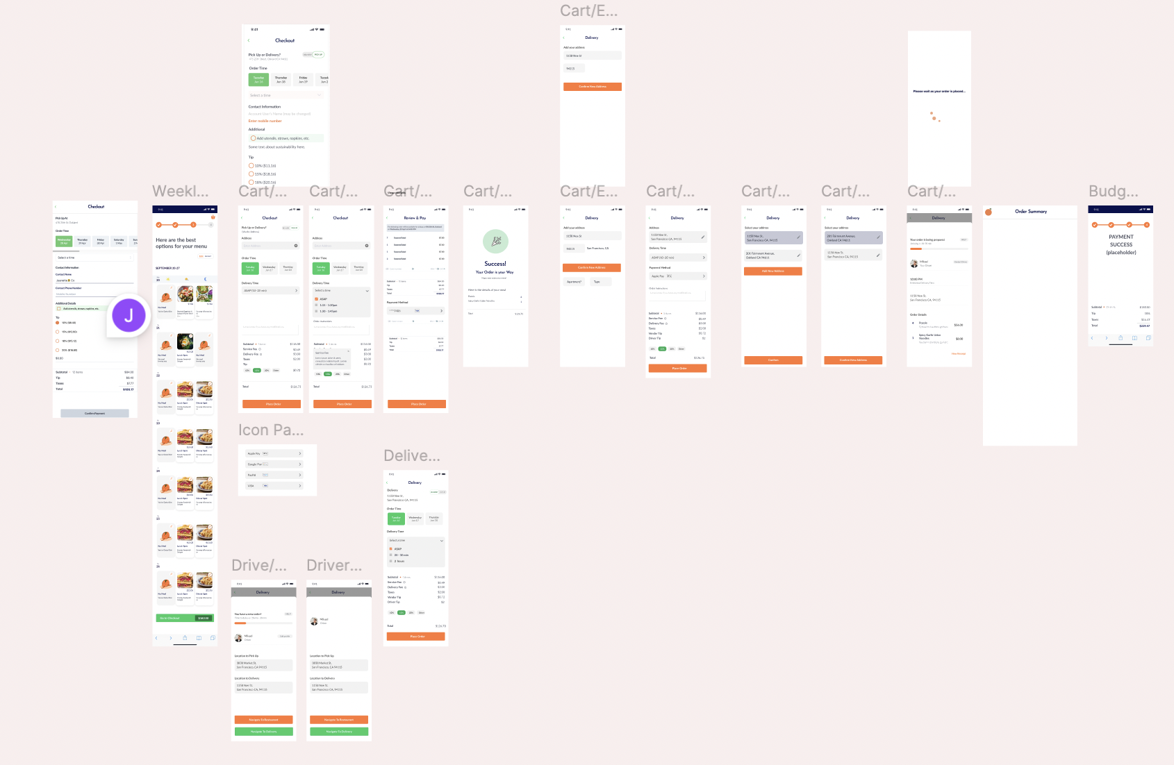
Developed the checkout screen flows and wireframes end-to-end
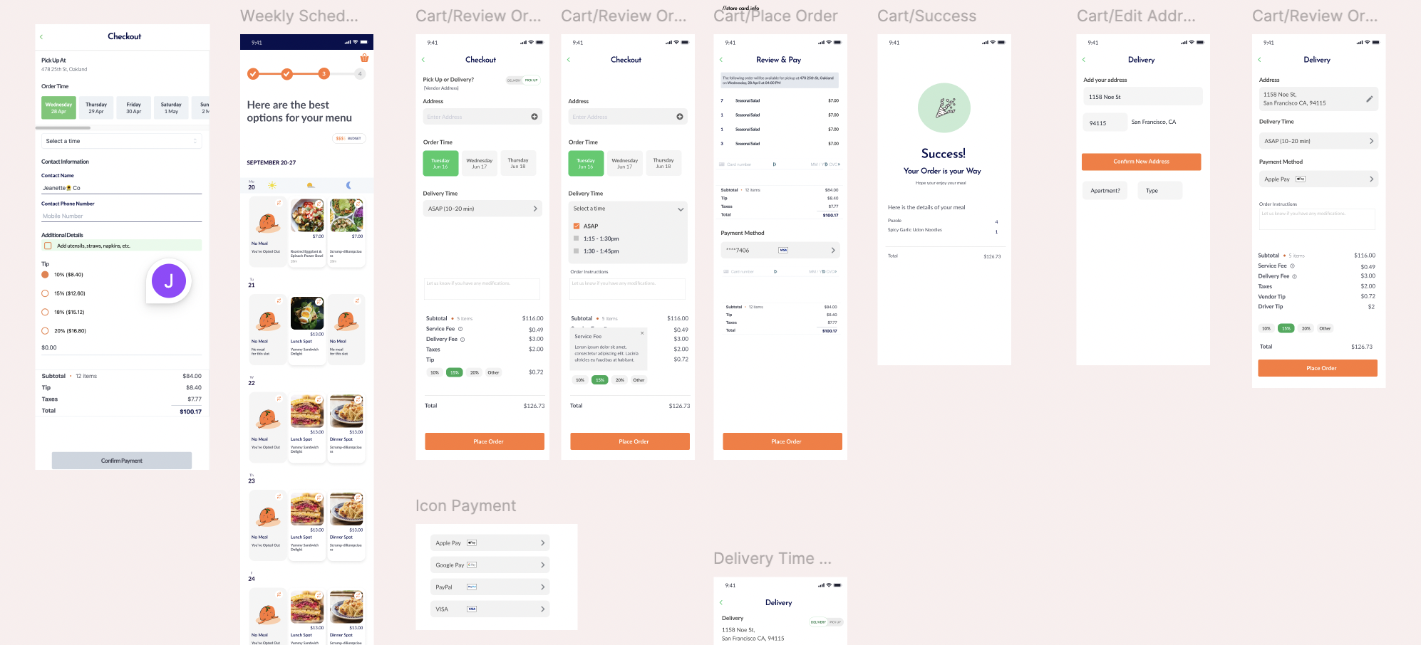
Screen UX/UI flows for ordering and customer delivery, payment, scheduling, and tip options
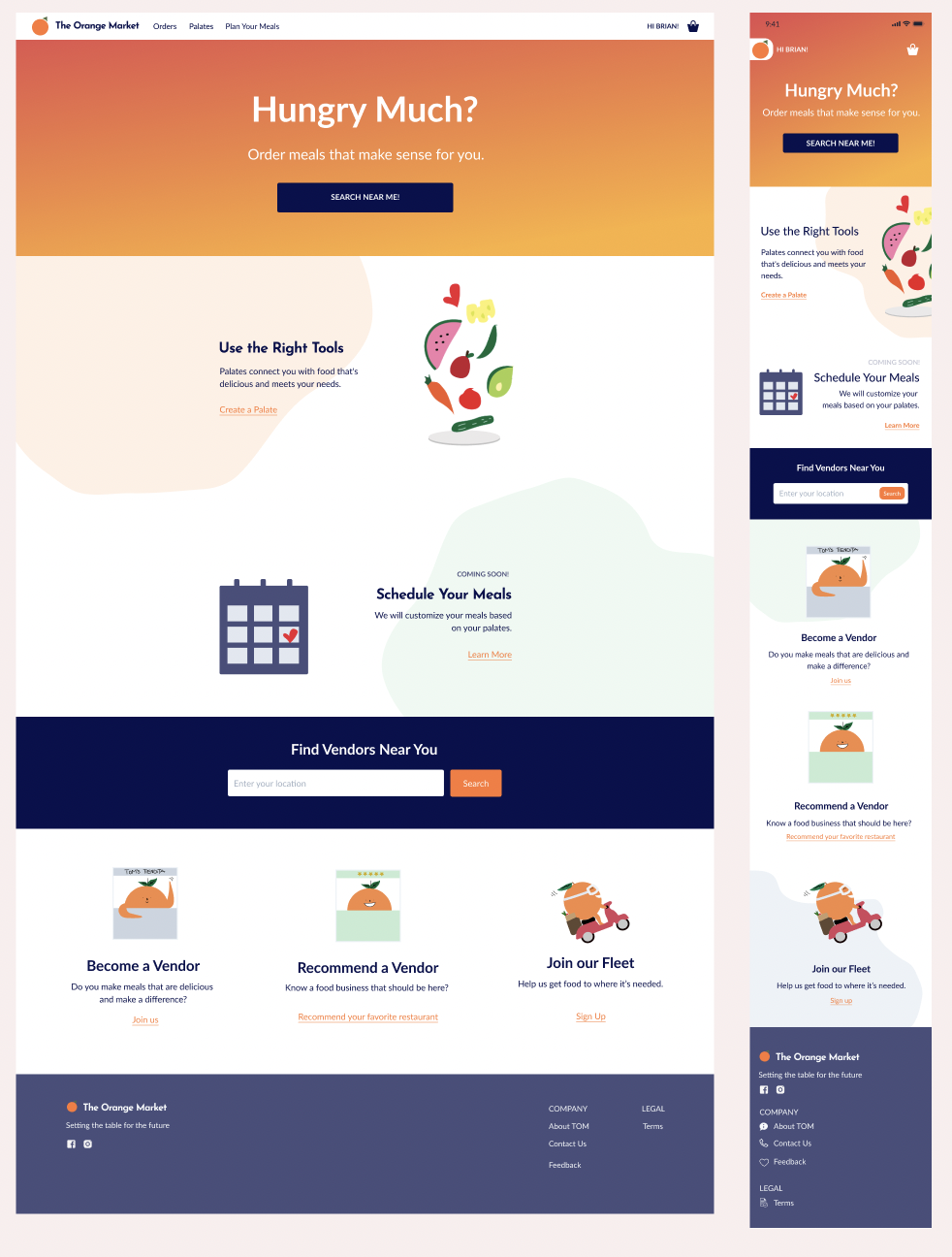
Work in progress website layout and copy aimed to get customer, vendor, and delivery crew signups
Mission statement of company and customer benefits
A/B Testing for vendor and delivery
Payment screen layout for both customer and delivery side
Collaboration in JIRA, Notion, Figma, and Slack to coordinate all aspects and screens for the app
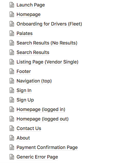
Created content for all these sub categories of the platform